

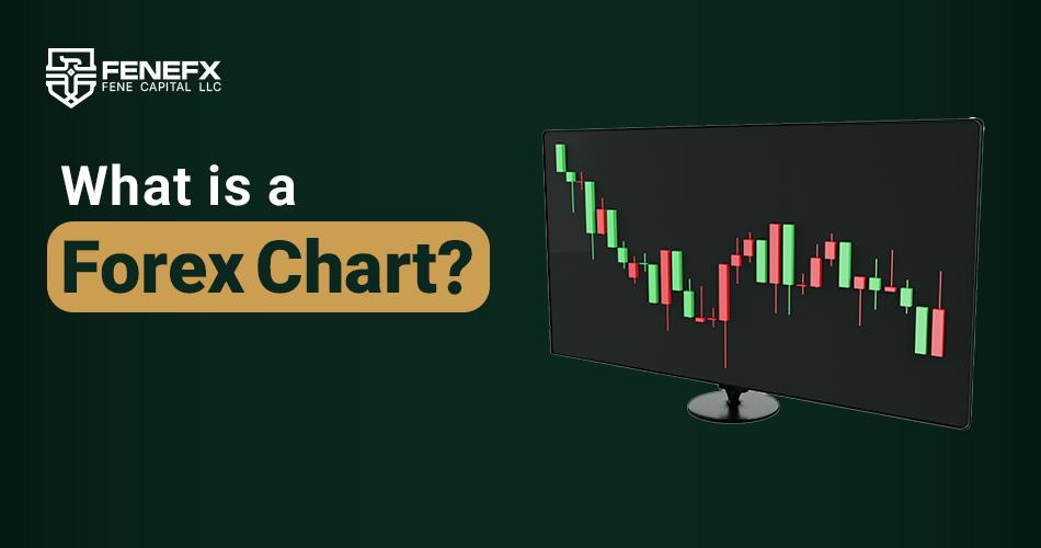
What is a Forex Chart?
A forex chart or currency chart is one of the main tools in financial market analysis that helps traders analyze price movement trends and make trading decisions based on historical data. In fact, charts are visual representations of price changes for a currency pair over time, and traders use them to predict market direction. Forex charts are particularly important for technical analysis. These charts can directly show market trends, entry and exit points, and even support and resistance levels. Without accurate and efficient charts, market analysis would be nearly impossible, as raw price data alone cannot display precise trend changes.
Forex charts include various data such as open, close, highest, and lowest prices for each time period. This data is continuously updated to provide an accurate picture of the market at any moment. Since forex is a very dynamic market that operates 24 hours a day, charts allow traders to monitor rapid and severe market changes and react in a timely manner.
Charts have multiple applications for both professional and beginner traders. For example, professional traders use charts to identify long term and short term trends, while beginners may use them to identify simple entry and exit signals. In general, forex charts are one of the main pillars of analysis in this market, and without using them, trading decisions could be based on chance and guesswork.
Types of Forex Charts: Choosing the Best Type for Market Analysis
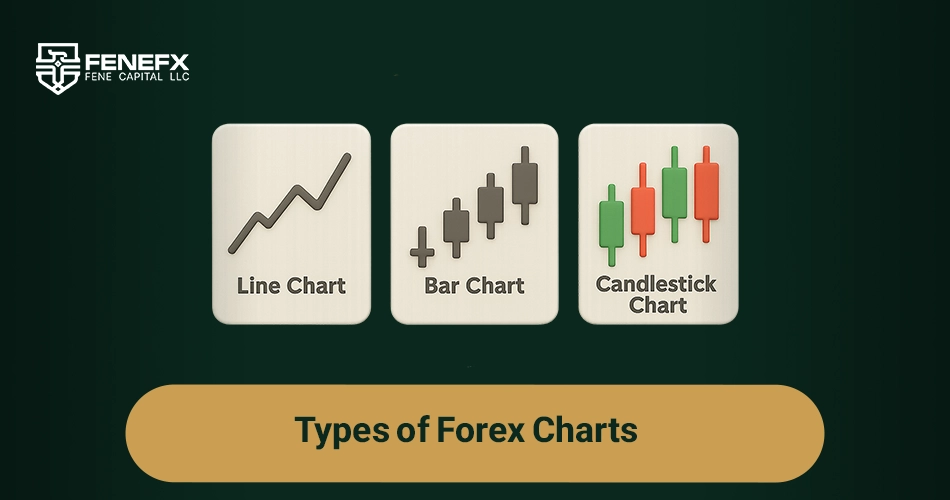
In forex, charts can be displayed in different formats, each with its own features and advantages. Choosing the right chart type depending on trading strategy, skills, and goals can have a significant impact on the accuracy of predictions and consequently success in trading. In this section, we will examine three common types of forex charts typically used by traders: line charts, bar charts, and candlestick charts.
Line Chart
The line chart is the simplest type of chart, most suitable for beginners. This chart only shows the closing price of each candle (bar) in a specific time period and creates a continuous line between closing price points. While line charts can show an overall picture of market trends, they do not provide more detailed information such as open, highest, and lowest prices to the trader. This type of chart is most useful for identifying general and long term market trends.
Bar Chart
Bar charts provide more detailed information compared to line charts. Each bar in this chart includes four price points: open price, close price, highest, and lowest price in that time frame. This chart allows traders to receive more information for more precise decision making. Bar charts are mostly used by traders interested in technical analysis who want to analyze market behavior in each time period.
Candlestick Chart
The candlestick chart is one of the most popular types of charts in the forex market. This chart, as its name suggests, is displayed as candles. Each candle represents price movement in a specific time period and includes four price data points: open price, close price, highest, and lowest price. In this chart, the upper and lower parts of the candle represent the highest and lowest prices in that time frame, and the middle part of the candle, which is rectangular, represents the open and close prices. The colors of the candles also provide more information; typically, if the close price is higher than the open price, the candle is green (bullish), and if the close price is lower than the open price, the candle will be red (bearish).
Candlestick charts are particularly useful for traders looking for precise analysis and more accurate predictions of short term market trends. Additionally, candlestick patterns that form in candlestick charts can provide strong trading signals.
Components of Forex Charts: Complete Understanding of the Main Parts of the Chart
Forex charts consist of different parts, each providing specific information to the trader. A complete understanding of these components can help traders better analyze market trends and make more precise trading decisions. In this section, we introduce the main components of forex charts.
Open and Close Prices
One of the most important components of any forex chart is the open and close prices. The open price is the price at which a currency pair starts trading at the beginning of a specified time period (e.g., one minute, one hour, or one day), and the close price is the last price recorded at the end of that same time period. These two prices can provide a lot of information about market behavior during that time period. For example, if the close price is higher than the open price, this indicates an upward trend.
High and Low Prices
Each candle in a forex chart automatically shows the highest and lowest prices for that specific time period. This part of the chart helps traders observe market fluctuations and identify support and resistance levels. When the price of a currency pair reaches a higher level, it will likely act as resistance, and conversely, a lower level is recognized as support.
Trading Volume
Trading volume is another important component in forex charts that helps traders observe the level of market activity in each time period. High trading volume can indicate strong movement and confirmation of the existing market trend, while low volume may indicate uncertainty and weakness in the trend.
Time Frame
The time frame is another vital component of forex charts that determines the duration of each candle. Traders can use different time frames such as one minute, five minutes, one hour, four hours, daily, etc. Choosing the appropriate time frame depends on the trader's strategy and goal.
How to Use Forex Charts to Predict Market Trends?
Forex charts, as the main tool for technical analysis, are one of the most important resources for predicting market trends and making trading decisions. Traders can use the price data displayed in charts to identify market trends and take actions for entering or exiting trading positions.
Identifying Market Trends
The first step in using forex charts to predict market trends is identifying the overall market trend. Market trends are generally divided into three categories: upward trend, downward trend, and neutral trend. In charts, an upward trend is displayed by price movement upward, and a downward trend is displayed by price movement downward. A neutral trend refers to when the market has little fluctuation and price moves horizontally.
Using charts, market trends can be easily identified. For example, if the price is consistently increasing and recording new highs, this is an upward trend. Conversely, if the price is consistently decreasing and recording lower points, this indicates a downward trend.
Identifying Entry and Exit Points
Forex charts allow traders to identify market entry and exit points. One of the most important methods for identifying these points is using support and resistance levels. Support levels generally refer to areas of the chart where price returns upward, and resistance levels refer to areas where price returns downward.
The difference between these two levels is usually determined based on past price behaviors. When price reaches a support level, it typically tends to return upward, and when it approaches a resistance level, it likely comes down. These levels can be good points for entering or exiting the market.
Price Patterns
Another method for predicting market trends using charts is identifying price patterns. These patterns typically appear in a specific form on candlestick charts and can give traders signals for the next price movement. Candlestick patterns such as reversal and continuation patterns can provide predictions about future market changes.
For example, two candle patterns (Engulfing) and Hammer patterns, especially in downward trends, can be used as reversal signals. Similarly, patterns such as ascending and descending triangles can indicate trend continuation.
Overall, forex charts are powerful tools for predicting market trends, and with careful analysis of their data, trading decisions can be made based on real data and documented predictions.
Technical Analysis and Forex Charts: How Do These Two Complement Each Other?
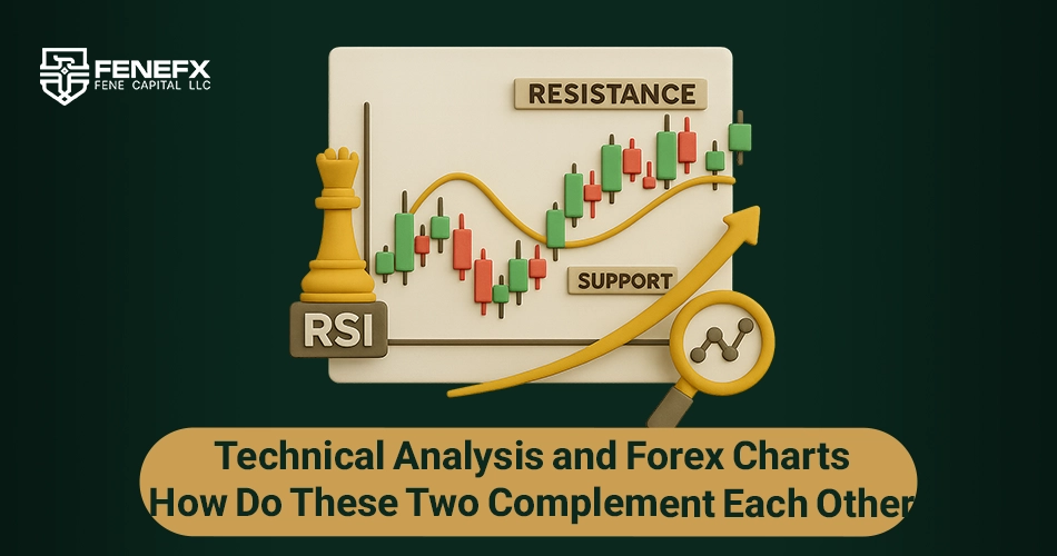
Technical analysis is one of the main methods of analysis in financial markets that uses historical price data, trading volume, and other information available in charts to predict future price movements. Forex charts, as the main platform for technical analysis, allow traders to observe past price trends and obtain a precise analysis of the market situation using various tools.
Using Indicators and Oscillators
Forex charts typically include various types of indicators and oscillators that traders can use to analyze trends and predict future prices. Indicators such as Moving Averages, Relative Strength Index (RSI), and MACD are among the most widely used tools in technical analysis.
Moving averages are particularly useful for identifying long term trends and help traders identify upward or downward trends. The Relative Strength Index (RSI) is also used to identify overbought or oversold points and can help traders become aware of potential reversal situations.
Support and Resistance Lines
One of the main tools in technical analysis is support and resistance lines that help traders identify levels where price has repeatedly encountered. Forex charts clearly show these levels, and traders can use them to identify entry and exit points.
In fact, technical analysis is not possible without using charts and these various tools, because without seeing historical price trends and using indicators, trading decisions may be made randomly.
Price Patterns in Technical Analysis
Another important aspect of technical analysis is identifying price patterns. Patterns such as head and shoulders, triangles, channels, and double tops and double bottoms can provide strong signals for traders. These patterns are usually clearly visible in forex charts and help traders predict the likelihood of price changes.
Ultimately, forex charts as the main tool for technical analysis allow traders to make their trading decisions based on precise and documented analyses and use various tools to predict market changes.
Price Patterns in Forex Charts: Identification and Interpretation
Price patterns are one of the main tools in technical analysis that traders use to identify potential market trends and predict price changes. These patterns typically form based on past price behavior in forex charts and can be used as trading signals.
Reversal Patterns
Reversal patterns indicate a change in market trend direction. One of the most important and common reversal patterns in forex charts is the Head and Shoulders pattern. This pattern typically forms at the end of an upward trend and indicates a change to a downward trend. Additionally, the inverse Head and Shoulders pattern, which forms at the end of a downward trend, indicates a change to an upward trend.
Another pattern known as a reversal pattern is the Hammer pattern. This pattern typically appears at the end of a downward trend and indicates that buyers are returning to the market.
Continuation Patterns
Continuation patterns indicate that the existing trend will continue. One of the most famous continuation patterns is the Triangle pattern. Triangles can appear as ascending triangles, descending triangles, or symmetrical triangles. These patterns indicate the continuation of a trend, and typically after price compression and pattern formation, the market moves toward continuing the trend.
Flag and Pennant patterns are also other continuation patterns that indicate a short rest in the trend and the continuation of price movement in the direction of the main trend.
Continuation and reversal patterns in forex charts allow traders to have an accurate prediction of price movement and make better trading decisions.
Comments
Nice and beginner-friendly, well done.
I remember opening MT4 for the first time and just staring at the screen for an hour, totally lost. Articles like this would've saved me weeks.
This is the first explanation of chart types and timeframes that didn't make my head spin. Appreciate it.
Which timeframe would you recommend a complete beginner starts on? A follow-up on reading candlestick patterns would be awesome too.
Solid intro. One thing I'd add — candlesticks get all the attention but plain line charts are underrated for spotting clean structure. I still flip to line view when the candles get noisy.